

In an era where apps and GPS deliver seamless turn-by-turn directions, navigating a real city can still be surprisingly frustrating. Many urban environments remain a maze of confusing signs, disjointed maps, and hidden pathways that leave even locals and tourists disoriented. This raises an intriguing question: if we spend so much effort to optimize digital interfaces for users, why shouldn’t our cities be just as intuitive to navigate? Urban planners and designers around the world are now treating the city itself as a user interface – a concept known as urban legibility – to make streets and neighborhoods easier to read and explore. By applying principles of user experience (UX) design to public spaces, these “legible cities” are finding new ways to guide people effectively through the urban landscape.
Featured Image Agora Maximus, Tactical Urbanism Project / LAAB Collective + Signature Design Communication. Image © Raphaël Thibodeau
The Concept of a Legible City
The idea of urban legibility was first formalized by American urban planner Kevin Lynch in his 1960 book The Image of the City. Lynch used the term to describe how easily people can understand and navigate a city’s layout by identifying key features like clear paths, recognizable landmarks, distinct districts, and obvious nodes (gathering points). When these elements are designed well, a city becomes “readable” at a glance – much like a well-designed map or a clean website interface. People feel more secure when they can mentally map where they are and where they need to go. They are also more likely to explore further, rather than sticking only to routes they already know.
In essence, a legible city functions like a physical interface that caters to many types of users. Residents, commuters, tourists, and people of all ages and abilities each experience the city differently. For example, a daily commuter may need the fastest route to work, while a first-time visitor needs clear orientation and pointers to major attractions. Just as a smartphone app anticipates different user journeys, a well-planned city anticipates these diverse needs through its signage, maps, and spatial layout. Cities that embrace this user-first mindset are finding that good wayfinding design isn’t just about signage – it’s about crafting a positive urban experience for everyone.
From Bristol to a Global Movement
Although architects and planners have discussed legibility for decades, it wasn’t until the late 1990s that cities began implementing comprehensive “legible city” programs. A pioneering example was the Bristol Legible City project in the UK. Led by city planner Mike Rawlinson, Bristol’s initiative introduced a coordinated system of pedestrian signs, maps, and information panels to stitch together the city’s public spaces into one navigable whole. The concept proved influential: Rawlinson recalls that the key was planning the sign system as a connected network, rooted in research about how people move. “There is a science to this,” he explains, noting that designers modeled pedestrian flow scenarios to predict what information users would need at each step. “If you get that right … people just get on and move.”
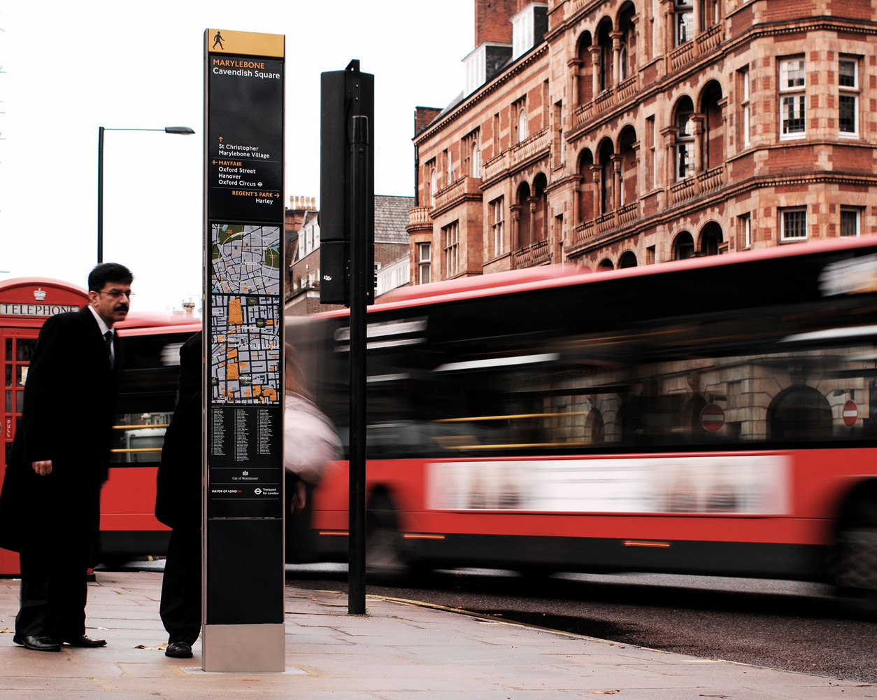
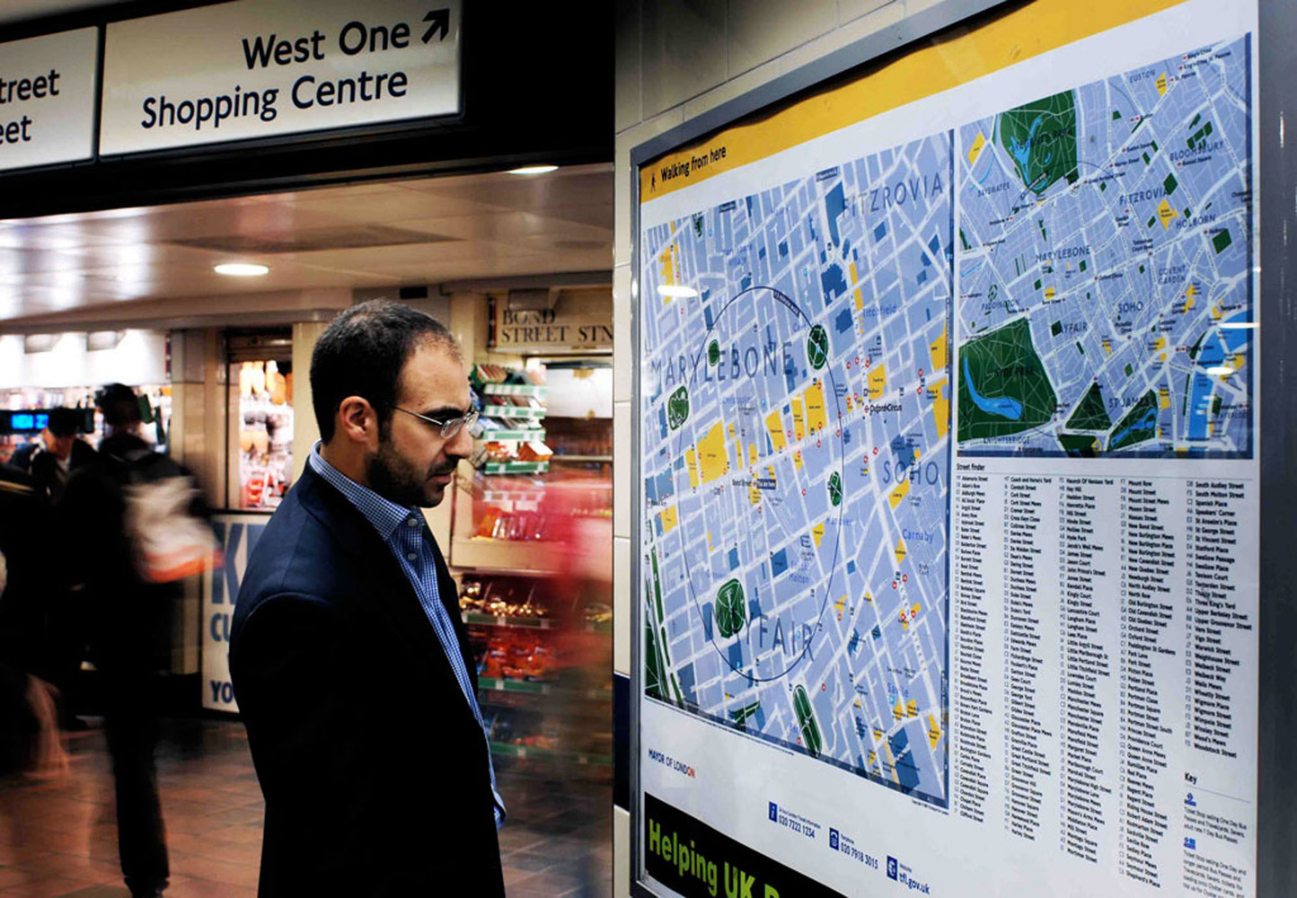
Inspired by Bristol’s success, other cities followed suit. Legible London, launched in the late 2000s, is perhaps the most famous example of a citywide wayfinding system. The project unified what had been a patchwork of 36 different signage schemes across central London into one consistent, user-friendly design language. Overseen by information designer Tim Fendley and his team at Applied, Legible London introduced tall map-based kiosks – nicknamed “monoliths” – at key pedestrian locations. Each provides an easy-to-read map oriented to the viewer’s perspective, plus walking distances and local points of interest. Crucially, all maps share the same graphic style, fonts, and color-coding, creating a cohesive “brand” for London’s streets. The system now includes over 1,500 signs covering almost the entire city, from the center to outer boroughs.
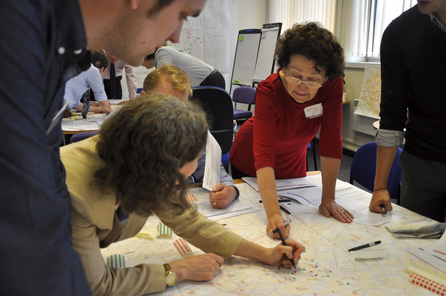
Legible London quickly set a new benchmark that has been exported worldwide. Cities such as New York, Moscow, Paris, Seattle, and Madrid have all developed pedestrian wayfinding programs modeled on this approach. In New York, for instance, city officials discovered that at any given moment a surprisingly high number of people in Manhattan were essentially lost, despite the city’s grid layout. This insight helped build the case for a unified mapping and signage network (known as WalkNYC), which rolled out across the five boroughs in the 2010s. Other world cities from Barcelona to Singapore are investing in better wayfinding as part of broader “smart city” efforts, recognizing that a legible urban environment improves everything from tourism to public transit usage.
Designing the City as a User Interface
What makes these legible city systems so effective is the application of UX design principles to the physical world. Just as a well-designed website or app guides users with logical menus and visuals, a city’s wayfinding design uses hierarchy, consistency, and clarity to guide pedestrians.
Information hierarchy is fundamental. The most important information – such as where you are and how to reach major destinations – should be immediately visible and easy to grasp. Less critical details can be provided in secondary layers. In practice, this means street signs and directional arrows are kept clear and uncluttered, while map panels offer additional context for those who want to browse. The Southampton Legible City project in the UK famously categorized information into three levels to serve different needs: Direct (the quickest route from A to B), Guide (suggested routes to maximize your experience, like scenic or shopping-friendly paths), and Show (highlighting hidden gems and local stories to encourage exploration). This tiered approach acknowledges that a hurried commuter and a leisurely tourist require different guidance, even if they’re in the same location.
Visual consistency and branding are another key. A unified design language – consistent typography, color schemes, and iconography – across all city signage creates a sense of familiarity that users can quickly recognize. In the wayfinding world, consistency builds trust: if you see a familiar style of sign at every corner, you know it’s part of the same system and will reliably help you. For example, the Legible London signs use a distinctive font and color palette (yellow-highlighted maps with navy and black accents) that is repeated on printed maps and even integrated into public transport information. Other cities have done similar things: New York’s WalkNYC signs employ a customized version of Helvetica for optimal clarity, and when City ID designed Moscow’s transit wayfinding, they even commissioned a new Cyrillic typeface so that signage would be easily readable for local users. This attention to graphic detail might seem trivial, but as Rawlinson puts it, “things like typography are used millions of times – why not think of it as part of the DNA of the city itself?”
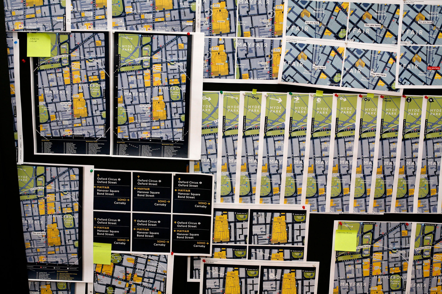
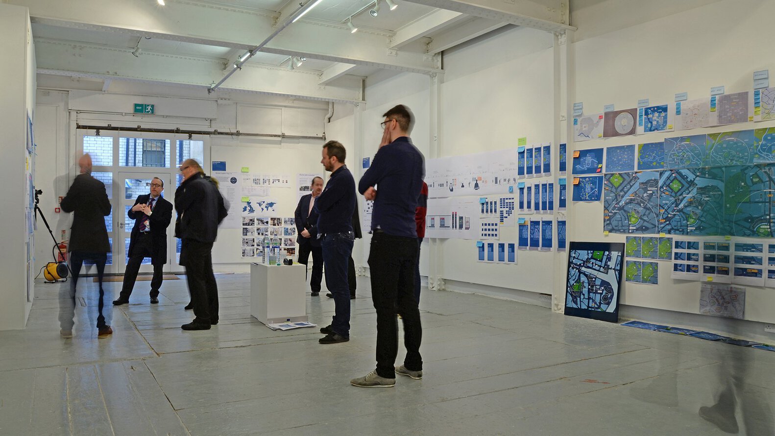
Designing an urban wayfinding system also involves a user-centered iterative process, much like digital product design. Rather than just guessing what will work, leading cities prototype and test their signage in the real world. When developing Legible London, Fendley’s team at Applied went through an astonishing 293 design iterations and then installed a pilot network of 19 prototype signs around Bond Street to gather feedback. They observed how people used (or didn’t use) the maps, then refined the design before scaling it citywide. “The only way to design anything good is to prototype it,” says Fendley, noting that traditionally transit agencies would install signage systems without this kind of user testing – often with mediocre results. By treating the city like a gigantic user interface, designers borrow techniques from software development: wireframing the information layout, running on-site usability tests, and continuously refining the “product” (in this case, the streetscape) based on how real users interact with it.
The Analog Advantage in a Digital World
Given the ubiquity of smartphones, one might wonder: why invest in physical signs at all when digital maps are in everyone’s pocket? It turns out that well-designed analog wayfinding tools have unique advantages that digital alone cannot replace. Human beings value speed and simplicity when figuring out where to go, and sometimes nothing is faster than a glance at a good old-fashioned map on a street corner. “An analog sign is still a lot quicker than using Google Maps on your phone,” argues Tim Fendley, whose firm continues to create legible city systems worldwide. We are wired to seek shortcuts, and a printed map or directional arrow requires no fumbling with a device or waiting for a GPS signal – it’s just there.

Another advantage of public signage is that it requires no personal technology or connectivity. A visitor emerging from a subway in an unfamiliar neighborhood might not have mobile data or may simply prefer not to stare at a phone screen on a busy street. A clearly marked local map at the station provides instant orientation. Importantly, physical signs also encourage people to form their own mental maps of the city. By looking around and situating oneself in the environment, a person starts learning the city’s layout. In contrast, when we rely solely on turn-by-turn voice directions, we might reach a destination with no idea of how we got there. As Patricia Brown – an urban strategist who helped spearhead Legible London – put it, “With a gadget, you outsource the solution – you don’t own the solution.” In other words, constantly following smartphone directions can make us passive navigators, whereas analog wayfinding tools invite us to actively engage with our surroundings and build internal knowledge of the city.
None of this is to say that analog signage alone is a panacea – it must be done well to be effective. A poorly placed or cluttered sign is as useless as a buggy app. But when thoughtfully designed, physical wayfinding tools can actually outperform high-tech solutions in ease of use. They are “always on,” never run out of battery, and can be used by anyone from a child to an elderly person without training. Indeed, many cities report that installing better pedestrian signage dramatically reduces the number of people who get lost and the time it takes to walk between popular destinations. In London’s case, studies after the Legible London rollout showed some striking results: pedestrians in areas with the new maps walked to their destinations about 16% faster on average, and the proportion of people who reported feeling lost dropped by over 60%. By simply making the city’s layout more legible, the system also nudged more people to choose walking over short transit rides or car trips – contributing to a measurable 5% increase in walking trips in central London. These are real-world benefits that smartphone navigation alone hadn’t achieved.
Blending Physical and Digital Wayfinding
Far from being an either-or choice, the best urban navigation systems today blend analog and digital tools to complement each other. Cities are increasingly integrating real-time information and interactive elements into the streetscape, bringing the benefits of digital technology into the public realm while retaining the intuitive, glanceable nature of physical signs.
One common approach is deploying digital kiosks or smart signboards in high-traffic areas. For example, downtown Barcelona has touch-screen kiosks that not only display maps but also live transit arrival times and even current crowd levels on major streets. Singapore’s Land Transport Authority offers a mobile app that pairs with digital displays in stations to give updates on train delays or crowd density, helping commuters choose less congested routes. In many cities, traditional static maps are now augmented by QR codes or NFC tags that people can scan with their phones to get more personalized directions or accessibility information. Even something as simple as posting walking times to nearby landmarks on street signs (a practice pioneered in Legible London) is a form of dynamic wayfinding that sets expectations and can influence behavior – for example, seeing that “Museum Quarter – 8 minutes” might encourage someone to stroll there instead of hopping in a taxi.
Augmented reality (AR) is also emerging as an innovative tool in urban wayfinding. In Tokyo’s enormous Shinjuku Station, trials have been conducted where a user can hold up a smartphone and see arrows overlaid on the camera view, pointing the way through a maze of corridors and exits. Similar AR navigation apps are being tested in airports and shopping malls, effectively painting a digital trail on the physical world for the user to follow. While AR city navigation is still in early stages, it points to a future where digital guidance is blended into our view of the city – perhaps through smart glasses – reducing the need to look down at a phone at all.
However, experts like Fendley caution that digital enhancements work best as a supplement to – not a replacement for – a fundamentally legible physical environment. A city must get the basics right first: clear street names, logical directional signs, and readable maps at key decision points, before layering on high-tech extras. The analog system provides a dependable backbone, and digital tools can then add convenience and personalization. When done right, the two together create a powerful synergy: the city becomes an interactive interface that caters both to the casual glance and to the deep dive of information, depending on what each user needs.
Benefits of a User-First City
Designing a city as an interface for people isn’t just an abstract exercise; it yields tangible benefits for urban life. The most immediate impact is on accessibility and confidence. Clear wayfinding lowers the barrier for anyone to move around independently, including those with disabilities, language differences, or simply no local knowledge. For instance, maps and signs that consider color contrast and legible fonts help the elderly and visually impaired. Some systems incorporate braille or audio features, and digital apps can offer multiple language options or voice guidance. When people feel the city “welcomes” them with helpful information, they gain the confidence to venture further afield. Tourists stray beyond the typical postcard attractions to discover local neighborhoods. New residents feel at home faster. Even longtime locals might notice amenities or shortcuts they hadn’t known before.
Better wayfinding also encourages healthier and greener choices. Cities like Southampton have explicitly used their legible city programs to promote walking and cycling: some signs there even include information about how many calories you’d burn or how much CO₂ you save by walking to a destination instead of driving. When signage shows that a park or museum is just a pleasant 10-minute walk away, people are more inclined to choose walking over hopping in a cab or bus. This not only benefits individual health but also reduces traffic congestion and emissions. A virtuous cycle can emerge: more people walking and biking create safer, livelier streets, which in turn encourage even more pedestrians to come out.
The economic upsides shouldn’t be overlooked either. A legible city tends to spread foot traffic – and thus customer spending – more evenly across districts, rather than having all visitors flock to the same well-trodden spots. New York’s WalkNYC project, for example, aimed to lead tourists beyond the usual Midtown icons by clearly marking cultural sites and business corridors in outer neighborhoods on its maps. The idea is that if people know what interesting shops or parks lie just a few blocks beyond their initial destination, they are more likely to explore and patronize those places. For local businesses, better wayfinding quite literally puts them on the map. City officials often justify the investment in signage by pointing to potential boosts in commerce. “It’s good for visitors – it’s good for businesses, too,” noted one New York City business leader during the launch of the WalkNYC maps, which were touted as a way to unlock neighborhoods for exploration. Janette Sadik-Khan, the NYC transportation commissioner who championed that program, observed that even lifelong New Yorkers can feel “turned around” on the city’s streets, so a “unified pedestrian sign system is a step in the right direction.” In city after city, leaders are finding that clear wayfinding not only helps people get around but also encourages them to linger and discover – bringing more life (and spending) into public spaces.
Perhaps the most profound benefit is harder to measure but deeply felt: a stronger sense of place. When people can navigate effortlessly, they are free to focus on the city itself – its architecture, its public art, the bustle of street life – rather than constantly worrying about getting lost. Wayfinding design, at its best, makes the city legible without making it overly scripted or sterile. It gives users the tools to find their way, but also the freedom to roam. The creators of Legible London often talked about giving people “the confidence to get lost.” That paradox captures the spirit of a user-first city: by reducing the anxiety of navigation, a legible city actually invites you to wander down that side street, discover a hidden courtyard, and form your own mental map full of personal landmarks. In an age when digital navigation can sometimes lead us through cities as if on autopilot, a thoughtfully designed urban environment can restore a bit of the magic of spontaneous urban exploration.
Conclusion
The movement to treat the city as an interface is ultimately about humanizing urban design. It recognizes that cities, like good software, should be user-friendly. By borrowing the best ideas from UX design – clarity, consistency, feedback loops, and iterative improvements – urban planners and designers are making cities that not only function better but also feel better to inhabit. From the humble street sign to the cutting-edge navigation app, every tool has its place in enhancing how we experience the city. The challenge going forward is to strike the right balance between analog and digital, ensuring that technology enriches our journeys without overwhelming them. As cities continue to grow and data floods our environments, the principles of legibility serve as a gentle reminder: the urban landscape should be understandable at a human glance. When we achieve that, navigating city streets becomes not a chore to endure, but a delightful part of urban life itself.
Resources
- ArchDaily – “The City as Interface: How Legible Cities Rethink Wayfinding Using UX Design” (Ankitha Gattupalli, 2025)
- ArchDaily – “Tim Fendley Explains Why Analog Wayfinding Tools Matter in a Digital World” (Giovanna Dunmall, 2021)
- The Guardian – “Are better signs the secret to a successful city?” (Steven Poole, 2014)
- DesignWanted – “Legible London: The effective wayfinding system that creates ‘readable’ cities” (Interview with Tim Fendley, 2020)
- Rethinking The Future – “The Use of Digital Technology in Wayfinding” (2023)
- Applied Information Group – Legible London (Project case study and data, accessed 2026)
- Walkonomics – “Legible London is a seriously funky wayfinding system, but does it get more people walking?” (Adam Davies, 2011/2020)
- NYC DOT – “Commissioner Sadik-Khan Announces WalkNYC Pedestrian Sign System” (Press Release, 2013)

