As an architect, your architecture portfolio plays a powerful role in accelerating your professional success. And making your portfolio stand out can be overwhelming.
So, we are here to help give your architecture portfolio that extra edge by guiding you to choose the right fronts. This way, you can make your portfolio look more cohesive and polished, and make the right first impression.
We will recommend some of the most widely used architectural fonts used in the industry to give you a clear idea regarding what works and what doesn’t. By the end of this article, we believe you’ll have just the right font style for your portfolio.
You will also be able to develop your unique font style by combining different fonts. So, without any more jibber-jabber, let us dive right into it!
Architect Fonts

While preparing your architecture portfolio, it is natural for you to think about the best possible ways to communicate with the audience. Your portfolio needs to speak about your professional prowess and highlight any achievements as an architect.
Choosing the right font style will help you connect with your audience through compelling nonverbal reading. The right font will greatly uplift your portfolio and make it attractive to your target audiences.
Based on your preferences, you can choose between the two main font types, sans serif and serif. The difference between these two font types is the added extensions or “feet” in each letterform of the serif fonts that are absent in sans serif fonts.
Widely used serif fonts like Garamond and Times New Roman will make your portfolio easier to read. In comparison, sans serif fonts such as Helvetica will provide a crisp and modern look to your architecture portfolio.
You can choose any of these font types based on the demands of your architecture portfolio. Moreover, by selecting the right font style, you will successfully add an authentic visual dimension to your portfolio. So, it is safe to say that fonts are important to separate your portfolio from that of your competitors.
Popular Architectural Fonts to Consider
Choosing the right architectural font can be a confusing and cumbersome task with thousands of available font styles. But, the essential thing that will help you in this process is to search for fonts that can give your architectural portfolio a polished and professional look.
Not every font is suited for every purpose or project, and you need to decide on yours accordingly. You will hardly find an architectural portfolio in the Comic Sans font style. In contrast, Helvetica is a very commonly used architectural font.
So, to help you narrow down the search for the right font, we have compiled a list of the most popular as well as the best architectural fonts that will be suitable for your projects.
1. Futura
Futura falls under the sans serif font type and was created in the 1920s by Paul Renner. It is usually a favorite font style among contemporary architects and graphic designers.
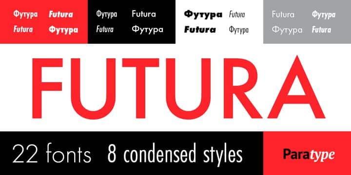
It is a classic example of Modern Graphic Design fonts. The letterforms of this font come with rounded edges and can add a subtle but significant visual impact to your architectural portfolio. So, if you are looking to amp up your graphic design portfolio, this can be an ideal choice.
It is specially used in making titles, short texts, and subtitles. The font can help lend a clean and corporate appearance to your portfolio layout.
2. Helvetica
As we mentioned earlier, Helvetica is one of the most popular architectural fonts. In most cases, architects intuitively go for this modern sans serif typeface due to its straight and minimalistic appearance. So, the use of Helvetica is very common among professional architects and graphic designers.
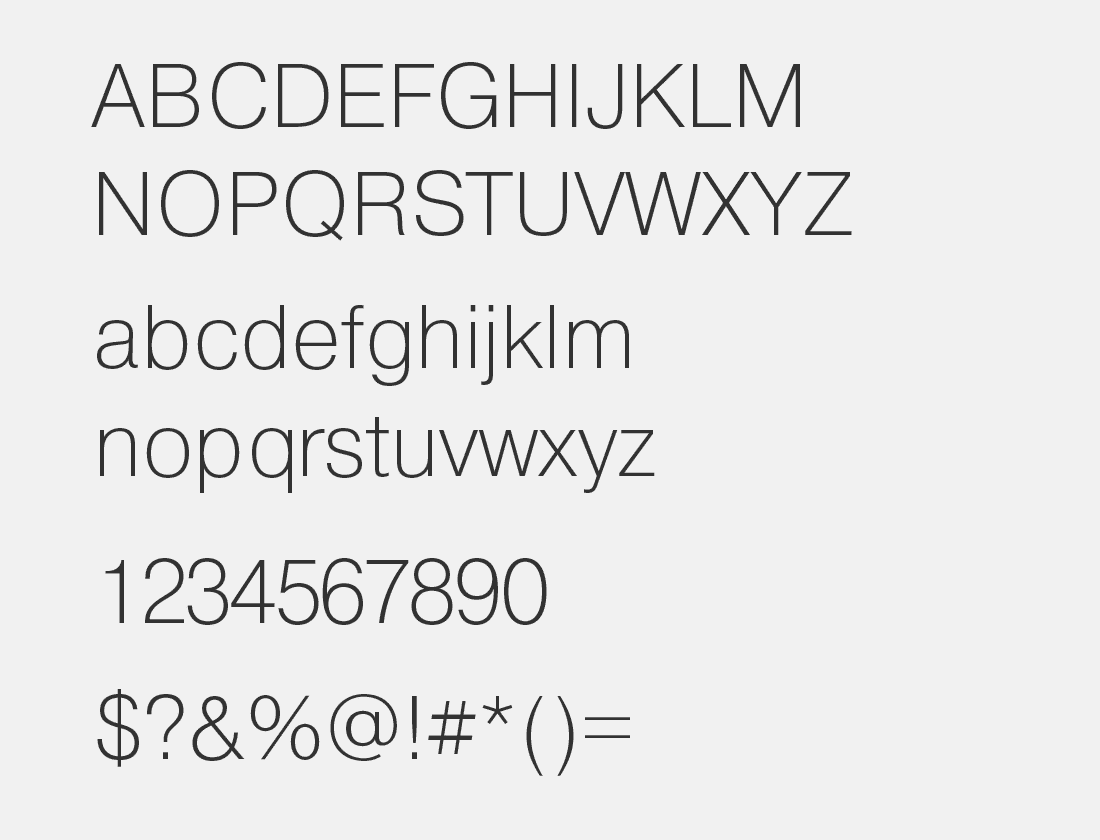
The font was developed during the late twentieth century by Swiss graphic designers Eduard Hoffmann and Max Miedinger. Over the years, it has become a favorite among professional architects due to its neutral and concise design.
If you are looking to give your designs and portfolio a clean and concise look, you can trust Helvetica to do the right thing.
3. Architect – Geometric Typeface
This font can be considered as a serif font with extensions of its letterforms. It can help you to design a portfolio that is uniquely creative and out of the box.
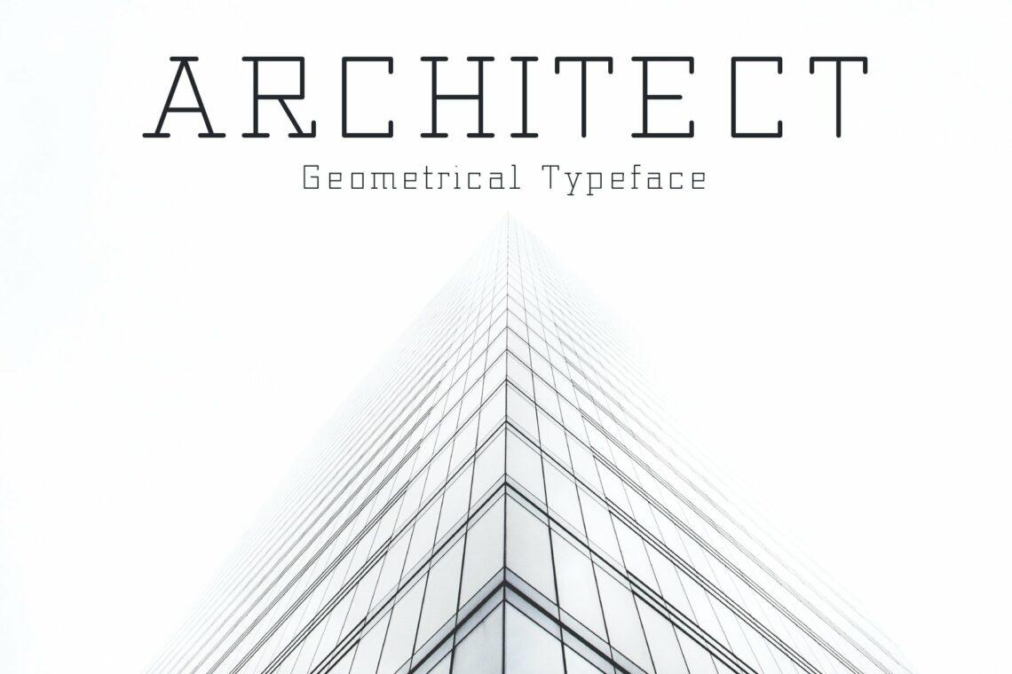
As the name suggests, the letterforms of this font style have been designed to resemble geometric structures such as straight lines, triangles, squares, rectangles, and so on. It has a strong and bold appeal that can spruce up your portfolio.
Although it is not as common as Helvetica, it can help create impactful layouts due to its geometric appeal. Furthermore, you can easily draw your audience’s attention towards headers, logos, and subtexts by applying this font.
4. Gotham
Developed in the early 21st century by graphic designer Tobias Frere-Jonas, Gotham is a sans serif font that is known for its geometric appeal. It provides a strong visual identity and is widely used in business cards, logos, and signage.
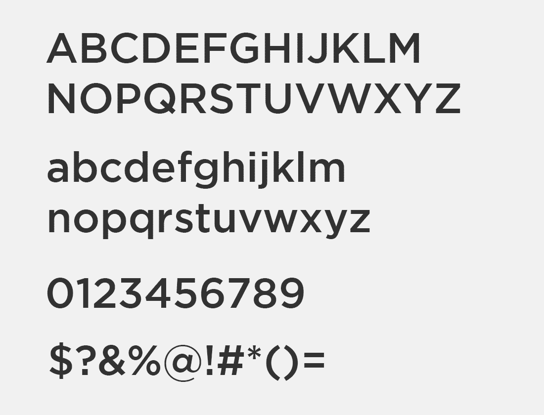
The font can be used for both headers and paragraphs due to its typography. Moreover, as its design was originally inspired by the architectural signage used in the twentieth century, it is a natural choice for architects.
You can also use this font if you are looking for greater publicity, as the bold lines of the letterforms in Gotham provide a sense of integrity and trust.
5. Consolas
The font is known for its simplistic yet aesthetically pleasing appeal. It was designed by Lucas de Groot and is part of the Clear Type Font Collection.
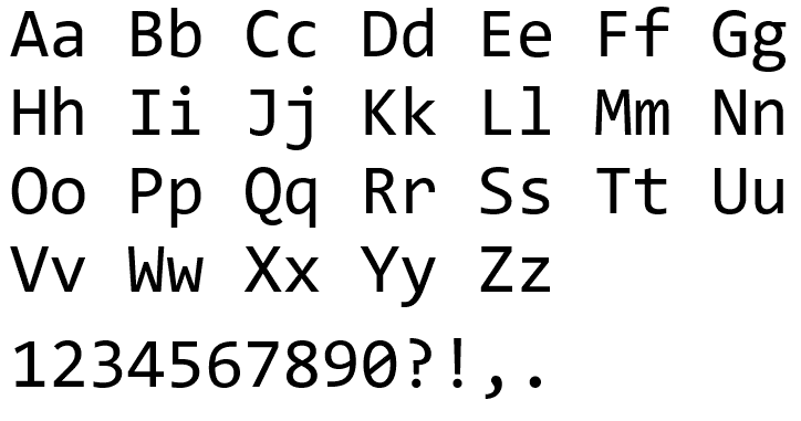
The proportionate lines and the simple and clean aesthetics make it a good choice for long texts. So, if you are planning to design a project for academic purposes or specialized architecture magazines, it can be a good option for you.
The breathable spaces between each inscription make it a suitable choice to ensure tireless reading. Hence, using this font for your architectural writing will make your portfolio much more reader-friendly.
6. Bauhaus
Bauhaus represents the rich history of architecture and graphic design. Herbert Bayer developed it in 1925, who was a former Bauhaus student. The typography of the font lends a timeless appeal as its conception is said to perceive transcending time and timelessness.

If you want to incorporate a creative and ephemeral look to your portfolio, this font can be a perfect fit for you. Moreover, you can also use it as an influential highlighter for the titles and subtitles of your portfolio.
The font also provides you with the option to use separate uppercase and lowercase letterforms. This way, it helps lend a timeless and creative look to your projects.
7. Neutra
This font was designed by graphic designer Christian Schwartz to honor the legacy of architect Robert Neutra. Richard Neutra’s son, Dion Neutra, and Julius Schulman were also involved in designing this font.
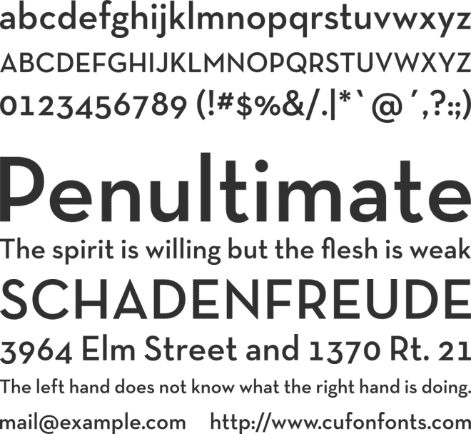
It has a geometric sans serif typeface, which makes it highly suitable for creating a powerful visual impact. Moreover, as Robert Neutra was a modernist architect, this font is also known for its modern and simplistic appeal.
If you are planning to create a modern architectural portfolio, you can apply this font for your titles and subtitles. Due to its striking resemblance with Futura, you can also use this to pair with Futura.
8. Bodoni
Bodoni can come as a pretty strong and powerful font due to its high aesthetic impact. Giambattista Bodoni created it in 1767, and it belongs to the serif typeface.
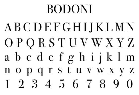
As the font has a strong aesthetic appeal, the letterforms are characterized by a strong set of lines and have a striking presence. It would be best if you were careful while using this font style, so that the result doesn’t become bulky or overbearing.
However, if you do decide to use this font style, you might need to restrict it for highlights such as titles and subtexts. It will not be a suitable choice for writing longer texts.
9. Aikido
As compared to any other architectural font, Aikido has a distinctly different appearance. If you are aiming to lend an unconventional and edgy look to your portfolio, this might just be the right font.
Aikido was developed by UI/UC designer Alexandru Molnar, and it has a very ultramodern graphic appearance. Furthermore, it greatly resembles the sketches of a graphic novel or animated series.
As it is very modern and edgy, you can use it to design your portfolio cover page. Needless to say, Aikido can help you create a completely unique and out-of-the-box portfolio design.
10. Metrica Font
This was created by Oliver James with the intent to feature a creative play of lines in the letterforms. It can greatly help you in creating a portfolio that features unique and thematic typography.
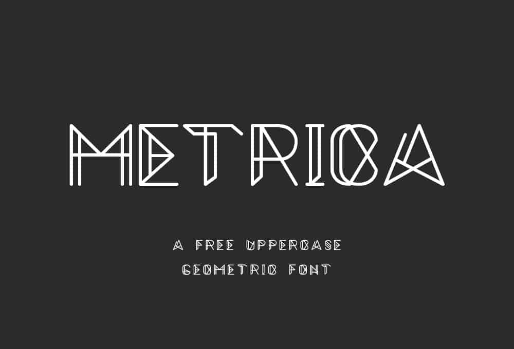
Moreover, the font can be very effective in drawing the attention of your target audience towards headings, keywords, and catchphrases. Thus, it can escalate the attractiveness of your architectural portfolio.
The font is also available in multiple weights featuring both uppercase and lowercase letters. So, you can use it to provide an extra visual dimension to your portfolio and enhance its creative appeal.
11. Lora
This is a versatile font that is available in four styles: Regular, Italic, Bold, and Bold Italic. It has a contemporary serif typeface and is inspired by modern calligraphy, which makes it a well-balanced font type suitable for long texts.
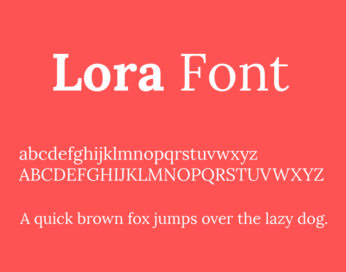
The calligraphic appeal of this font makes it perfect for long body texts with visual graphics. If you want your portfolio to have a modern artsy look, this font can be a perfect fit. Furthermore, the calligraphic appeal of Lora can be ideal for exhibiting art essays.
The contemporary serif typeface of the font can help you to design projects and portfolios with a unique storytelling format.
12. Brandon Grotesque
This font has a relatively new design that was developed by German designer Hannes von Döhren in 2010. It has a geometric sans serif typeface that is inspired by the early nineties. The elegant appearance of the letterforms makes this font an ideal choice for architectural minds.
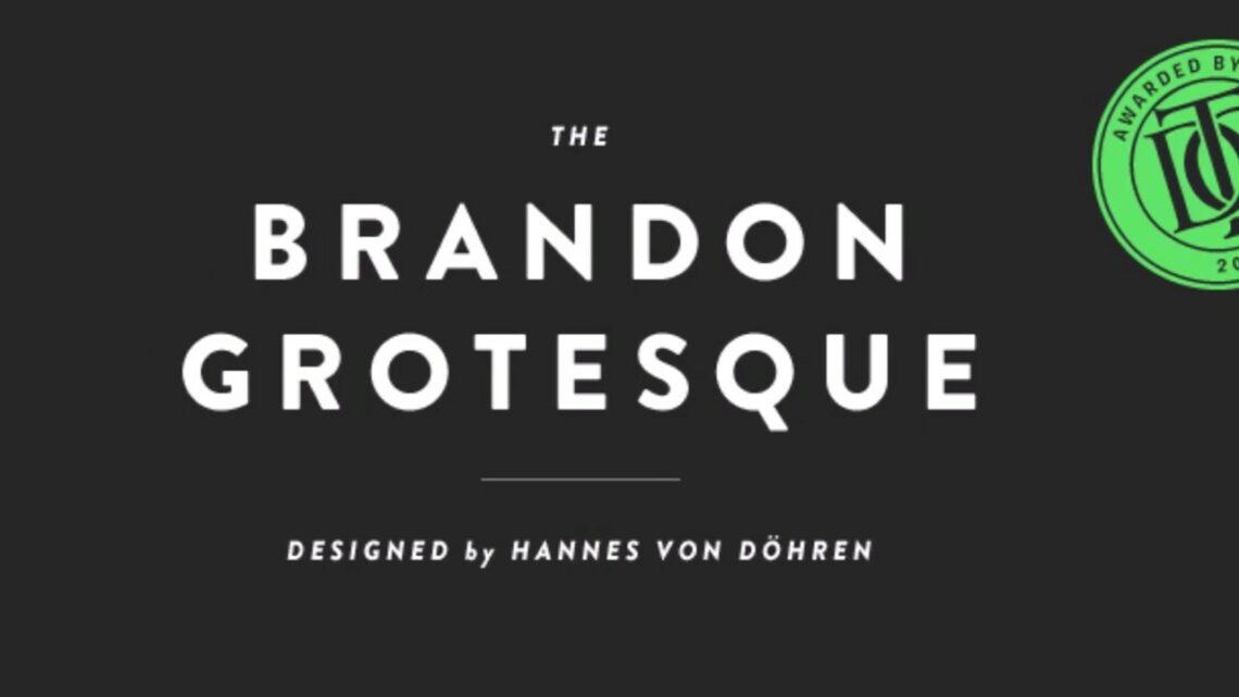
Moreover, it is also available in six different weights, including Thin, Regular, Light, Medium, Black, and Bold. The Italic version of all these weights is also available. So, by applying this font, you can incorporate multiple visual dimensions in your portfolio.
Furthermore, the font has been used in famous corporate layouts like Comedy Central as well as the portfolio of Sean Thompson, the designer of Twitter. So, the font can help in making your portfolio look both crisp and elegant to give it a professional corporate appeal.
13. Butler
The Butler font style was designed to incorporate some modernism to the otherwise classical serif font styles by working on the curves of the letterforms. Thus, this font style was created as a mix between the Bodoni family and Dala Floda.
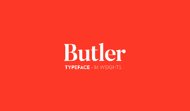
Adding the serif typeface of the Bodoni family with the extra stencil family, it was possible to incorporate curvilinear lines in this font that celebrates modern typography. Moreover, it has a total of 14 weights: seven stencil weights, and seven regular weights.
As the font style has a very strong and modern appeal, you can use it to enhance the attractiveness of any document and utilize its strong appeal by using it for titles and logos.
14. Modeka
This font was designed by Gatis Vilaks, has a clean and modern appeal that creates a harmonious relationship between the straight and curved lines in the letterforms. It has unique typography, which is essentially a system of hybrid lines.
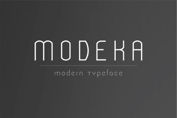
The font includes the rationalism of straight lines as well as the elegance of the curved lines. So, it is a highly versatile font that also maintains its subtlety. You can apply the font in your titles, textual details, and subtitles.
Moreover, the versatility of the font makes it a perfect choice for designing the titles in the graphic composition of drawings and boards.
15. Poplar
This font is part of Adobe and was designed by Barbara Lind. It has a sans serif typeface and incorporates strength and personality in its letterforms. So, it can be ideal for highlighting titles and subtitles.
Furthermore, you can also use it in a wide range of applications due to its strong presence. It can be a good choice for schemes, diagrams, and for highlighting minute details and keynotes.
A Brief Guide To Architect Font Pairings
While designing their architectural portfolios, most professionals go for the popular architect fonts such Futura and Helvetica as suitable pairings. These fonts have a modern and well-balanced, consistent design that can amp up the appeal of a portfolio.
You can start by choosing different fonts for your titles and body texts. In this context, it’s best to effectively pair serif and sans serif fonts. You can use a serif font for the title and a sans serif font for the body text, or vice-versa. But be aware not to combine them together in the title or the body text.
Furthermore, it would help if you paired the fonts in such a way that they look harmonious and pleasing to the eyes. For instance, pairing Helvetica as the title font with Garamond as the text font can be a good choice.
But, we think it will be better if you try to avoid using overused fonts such as Arial or Times New Roman while creating your architectural portfolio. And also, try to maintain visual consistency by not using more than 2 or 3 fonts in your portfolio.
Moreover, you can work on developing your personal font style by exploring and experimenting with different fonts. You can incorporate your individual style and preference by using fonts that are non-traditional and out of the box. Once you start exploring all available font options, you’ll soon develop an eye for personal favorites.

Verdict
It is quite natural for you to get confused while choosing the right font for your portfolio. But now that you have gone through this article, we hope you have a better grasp of architectural fonts.
If you want to create a professional-level portfolio, you can take the time and explore all available options. You can also focus on developing your personal font style by pairing unconventional fonts that look harmonious together.
Be sure to choose from among our recommended architectural fonts to kickstart your design. However, if you are running on a tight schedule and looking for a quick fix, you can always trust architectural fonts like Futura, Helvetica, or Gotham to do the trick.
That’s all for today then. Good luck and take care!
Related Articles
14 Best Architecture Cut Out People Websites to Check
Architecture Site Analysis | Architect Guide
19 Best Urbanism, Design, Architecture Podcasts to Follow
22 Best Apps For Architects to Consider
Best CAD Program For Architects | All You Need To Know
Architecture Career Success Tips | Millennial Edition
Architecture And The Culture Of Long Hours
Are Architecture Internships the Most Important Jobs Of Your Career?
Architecture Interview Attire Dissected | What to Wear to an Architecture Job Interview
How To Create A Target List Of Architecture Firms
Learn How To Ace Your Architecture Phone Interview
The Architect and His Career in the Social Media Era
Things to Consider Before Accepting Your [Architecture] Dream Job


