Chartreuse. A color you have seen yet have failed to name, often ending up describing it as yellow-green. It’s a color that always manages to stand out and is commonly spotted in those peppy interior design magazines. Like the blue-green color and its subtle tones, the chartreuse is a haughty one that is used best when other colors around it are toned down in warmth or are plainer, like white, grey, and peach.
For this reason, the chartreuse color doesn’t play along well and is a loner and an attention seeker that requires your extra care to integrate it with other colors.
What is Chartreuse Color?
Chartreuse is a range of colors lying between yellow and green, originating from the French liqueur ‘Chartreuse,’ developed by Carthusian monks in the 1740s.
Chartreuse Yellow or Chartreuse Green are the two variants typically recognized. Chartreuse Yellow, resembling the color of the original liqueur, is a vividly intense yellow-green hue, while Chartreuse Green is a darker, more forested green, named after the color of the liqueur’s green variant.
The Hex codes and RGB codes for each are as follows:
- Chartreuse Yellow: Hex – #DFFF00, RGB – (223, 255, 0)
- Chartreuse Green: Hex – #7FFF00, RGB – (127, 255, 0)
From a historical perspective, the name of this color was first recorded in English late in the 19th century. The usage of Chartreuse shows up in digital media, fashion design, interior decoration, landscaping, and other diverse applications due to its noteworthy intensity and vibrancy.
This specific color range, being so vibrant and robust, often imparts a sense of energy, zeal, growth, and renewal, symbolizing the features of Spring and nature. Precise and prudent use of Chartreuse can yield impactful, vibrant, and eye-catching designs due to its visual potency.
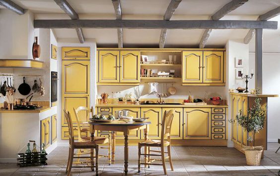
How to Use Chartreuse
Here are some useful tips to introduce this unusual color in your house or office space:
Wallflower?
Yes. But, more like a wallflower you observe.
Either paint the wall behind your bed with chartreuse or expand the pattern by painting a wall each in your house with chartreuse, often the wall you face towards, like where you have installed your home theater.
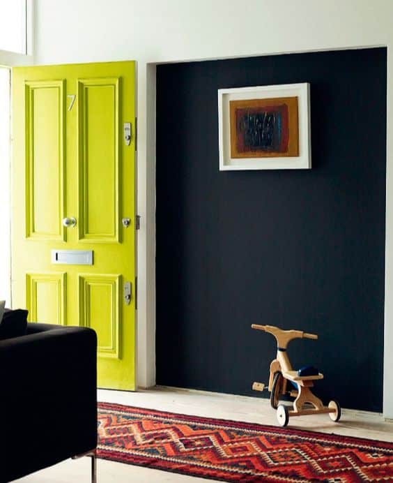
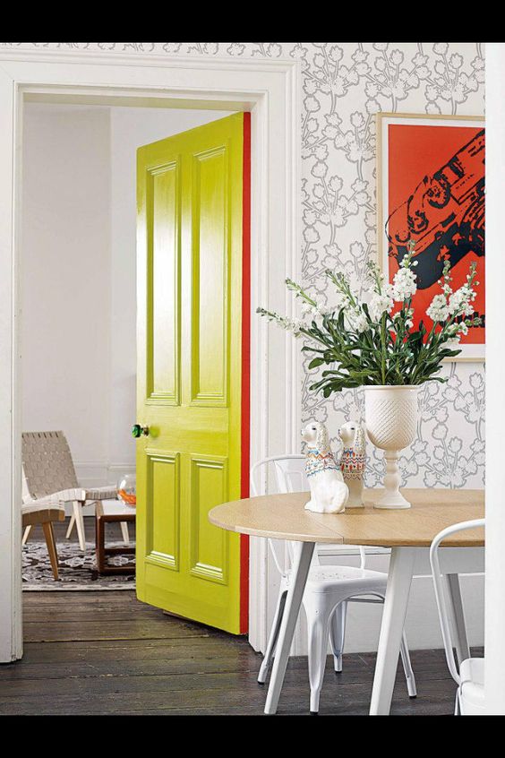
As mentioned before, chartreuse color works best with muted colors and brings an explosive vibrancy to the environment. You can use it for your window frame or paint a door that is at the intersection between your room and your hall.
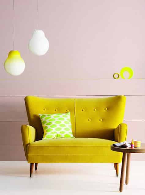
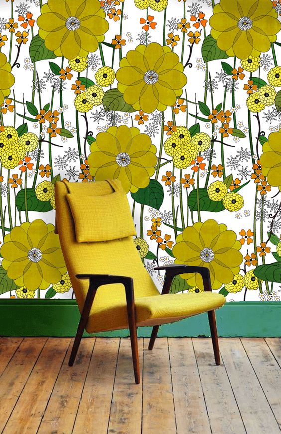
Or, you could paint more than one wall in a room, often facing each other or diagonally. Playing with a combination of chartreuse and white to decorate your house makes for a fresh view wherever you lay your eyes. Covering a wall or an entire room in chartreuse-colored wallpaper is an efficient way of incorporating it. You could also emboss the color in minimalistic designs on the walls.
Be Floored By Chartreuse Color
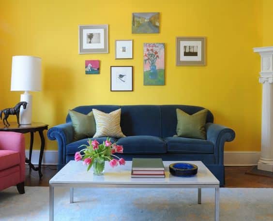
Using a chartreuse colored carpet or painting the floor woodwork gives you more options to experiment with whatever you keep on that floor. A combination of white, grey, black, brown, and cream for your decor brings a delicate balance to your chartreuse-laden floor. But if you’re in the mood for adventure, you can play with bolder colors for your furniture to give your house a more pop feel.
A Tincture on the Furniture
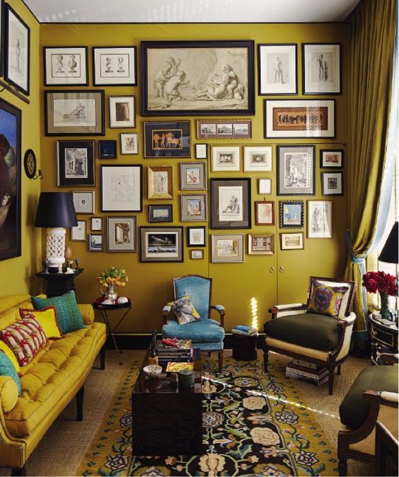
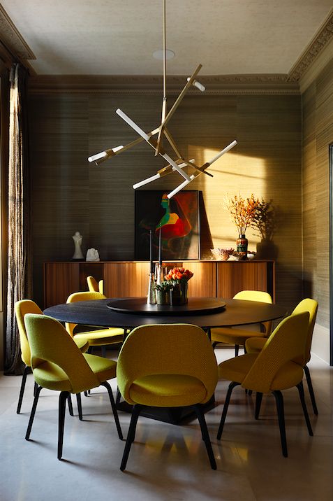
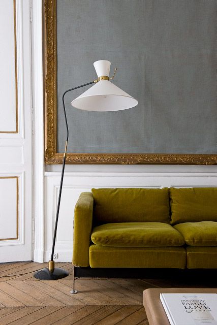
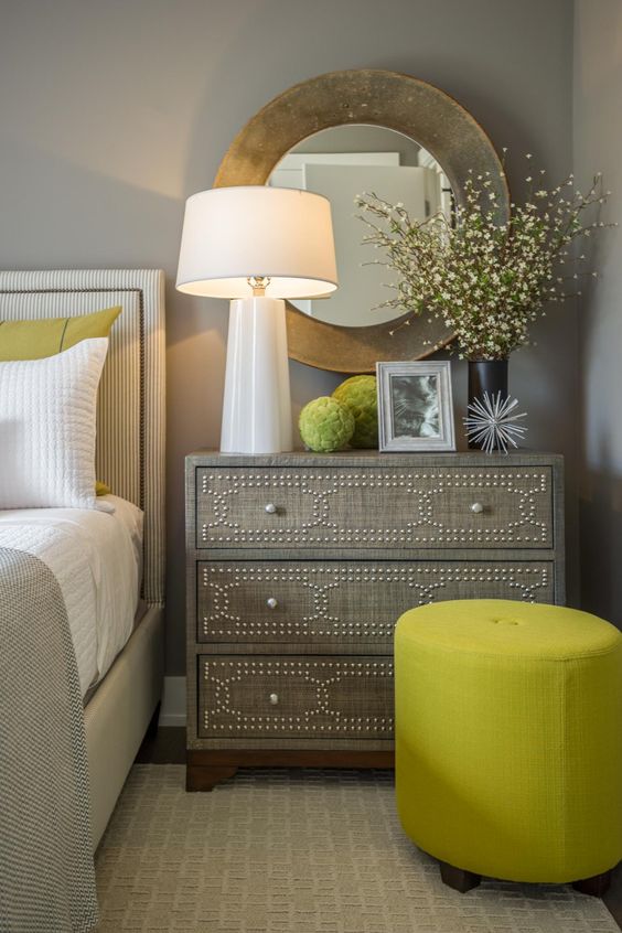
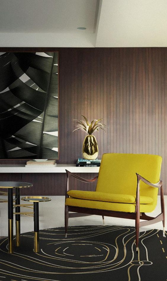
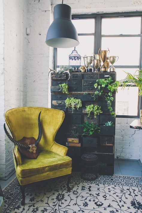
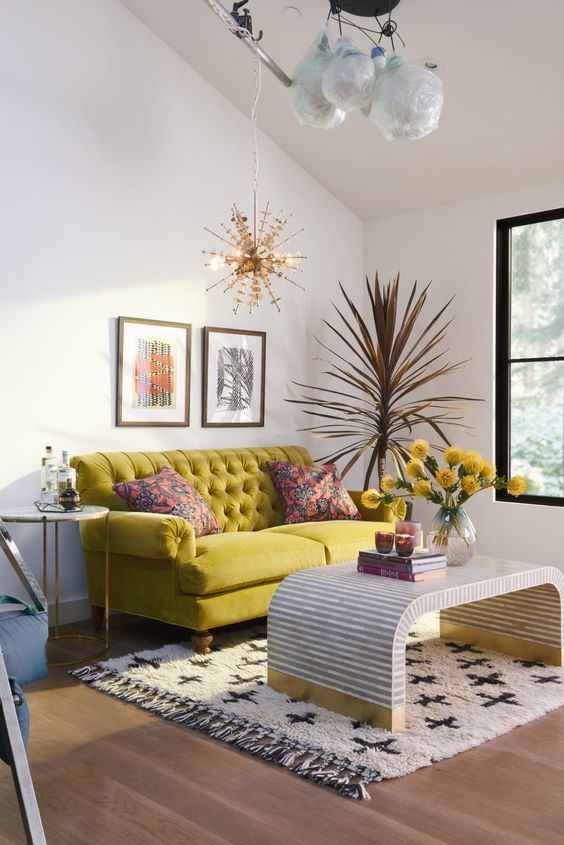
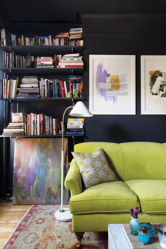
Going with the spirit of minimalism, you may very well have one piece of furniture in either your living room, bedroom, or kitchen (or all of them, because why not?) colored chartreuse. Imagine walking into your house, or your apartment, and that one cupboard, or one stool, or one chair placed there, talking back to you in its expressive hue.
A Dose of Chartreuse
You could go with the options above or you could go with all of them. A chartreuse colored wall in one room, and a floor in another, with one or more pieces of furniture beside or above them.
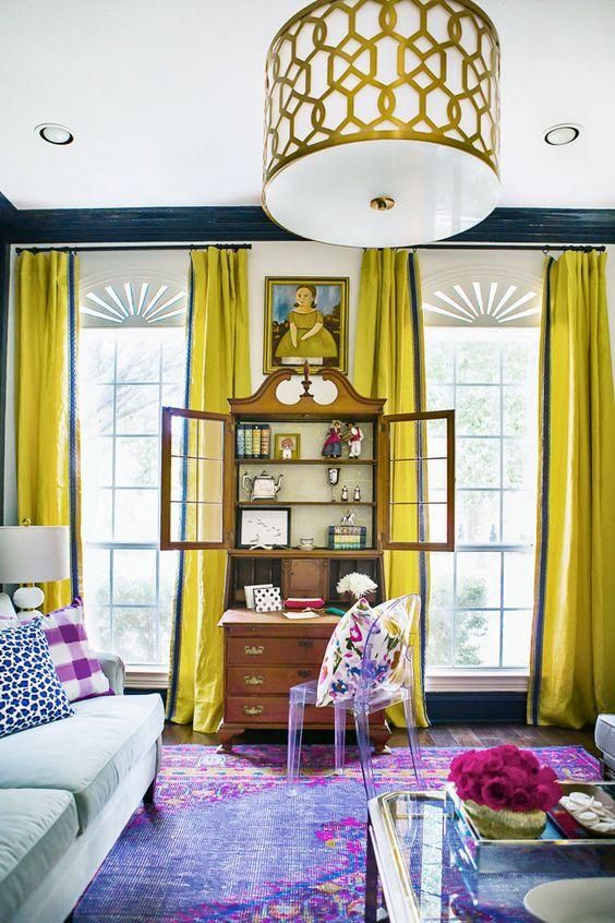
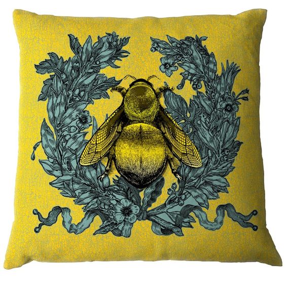
Bedsheets, pillows, or quilts of chartreuse color. Couches, hammocks, or ceiling fans. Cupboards, staircases, or vases. Dining table, kitchen platform, or curtains. A wild bunch for combination, and with infinite possibilities to experiment with different tones of chartreuse.
Add more green to the color, and it becomes more placid to the senses, add more yellow, and it feels refreshing. Complement these excesses by using combinations of these for different things and the contrast is beautiful.
As Above, So Below, As Without, So Within
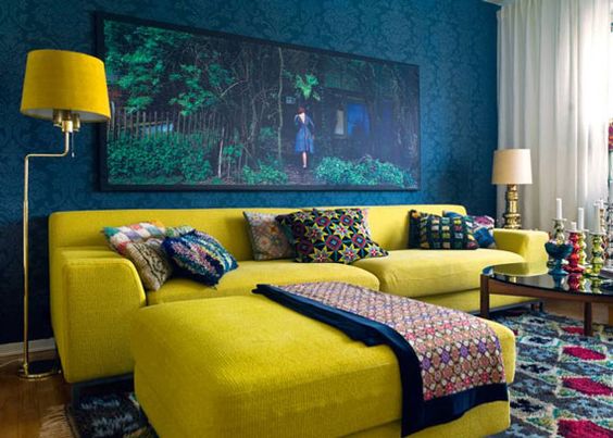
Chartreuse not only works as a fantastic color for the interiors but also for the exteriors of your house. The walls on your terrace, the railing of your front porch, the parapets and arches of your entrance, or the steps leading to your door. A lime-toned doormat, or the front door itself and similarly the back door.
You can also use the color to paint just the borders of your house, from the roof to the sides, alternate bricks if you’re into experimenting, and edges of your swimming pool.
If you maintain a garden, using chartreuse-hued plants and foliage adds extra freshness to the green. You can similarly use potted plants inside of your home and place them beside a piece of dull-colored furniture to add more life to your room.
To be fair, crockery, kitchen chairs, bean bags, study tables, lamps, lights, sockets, and appliances, all function as excellent canvasses for this color. Even something as insignificant looking as a pen stand or a towel can stand out when colored chartreuse.
The Many Hues of Chartreuse
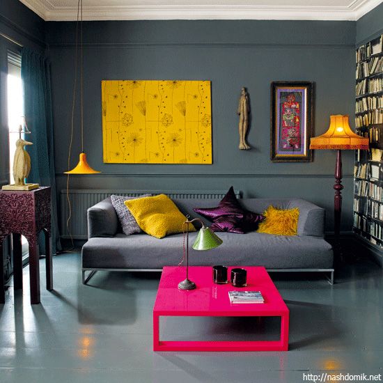
There are several hues and tones of Chartreuse color, so you don’t have to worry about it ever becoming monotonous!
Lime Green is one of the commonest, with its bright yellowish-green appearance.
Limeade is a bright shade with more yellow than green.
Light avocado, melange green, and martini olive are but a few other hues for you to choose from. The deeper you go down the tube of color combinations, the trippier the color gets. Add striations and different shapes to the way you apply the color, and you are a child with an unshackled imagination again.
What To Do? What To Choose?
It’s entirely up to you.
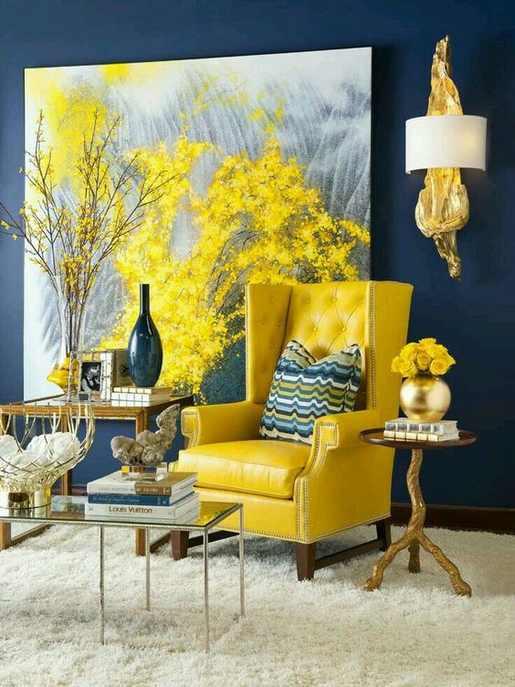
You can use it with a combination of muted colors, or even contrast it with different shades of reds and blues, or dominate the space with a whole lot of chartreuse.
It also goes well with styles specific to the past seven decades, blending in with or complementing the myriad interior decoration designs of the eras, and the modern minimalism at the same time.
It is a color that has been seen fondly for a long while, and it is not going out of fashion anytime soon.
After experiencing the very mathematical and monotonous architecture and color scheme of office spaces, it is always a delight to return home from a long and tiring day at work and just rest your eyes and refresh your spirit with this vigorously poetic color.
In fact, if you’re looking to spice up your office space there are more ways than just turning the chairs chartreuse or a band on the walls to make your workspace work better for your mental peace.
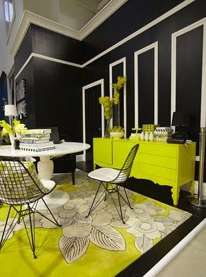
Home is where you spend most of your leisure time, and home is where you look for relaxation and inspiration. Adding a dash of colors, be it chartreuse color or otherwise, always helps to reinvigorate your senses and make you feel less claustrophobic.
We invite you to cast a glance at the following Chartreuse Interior Design Ideas and leave your feedback in the comment section below!
Chartreuse Interior Design Ideas
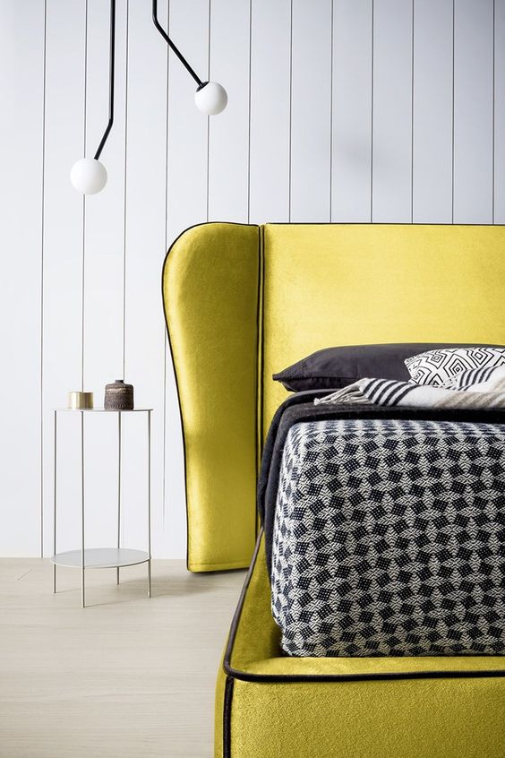
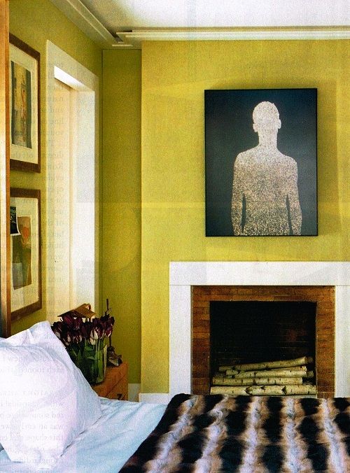
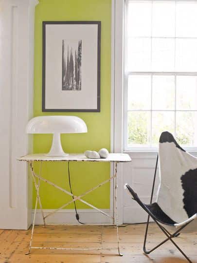
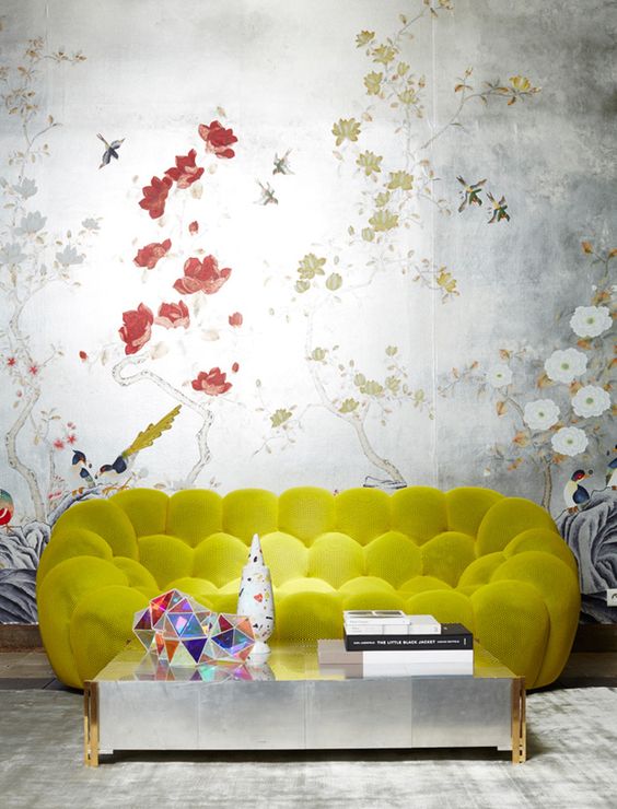
What do you think about the ideas above? We would love to hear from you in the comment section below!
Related Articles
What Color Goes With Chocolate Brown
What Color Goes With Navy Blue And White
What Color Goes With Purple And Green
What Color Goes With Black And Gold
What Color Goes With Tiffany Blue
What Walnut Color is and How It`s Used in Home Decor Today
What Color is Teal and How You Can Use It in Your Home Decor
What Color is Mikado and How You Can Use It
Learn What Taupe Color is and How You Should Actually Use It
Colors That Go With Gray and How to Decorate With Gray
Learn What Colors Go With Brown and How to Use Them

